Bootstrap - responsive layout designing with gridit
A drag n drop html5 editor
Gridit : An open source bootstrap layout designing tool.
Introduction
A few weeks ago i saw a post by Nadeeka on creating a twitter bootstrap layout generation plugin for gridster. I tested the plugin and the layout generation part was fine for the selected use case. But I realized that gridster is not the best tool to support layout generation since,
- Have to create initial gridster layout manually.
- Current version of gridster does not allow adding inner elements.
- Drag and drool feature of gridster prevents placing elements as wish in some scenarios.
So I started to create a better editor as a substitute for gridster in this use case.
Get Started
I developed the drag and drop editor using kineticjs, canvas drawing library for Html5. The application was developed as a meteor app since it is easy to develop, test and publish javascript apps using meteor.

The grid layout in editor represents html container with 12 columns grid system. You can simply drag n drop divs to the container with exact column sizes using the elements in toolbox. For an example col-07 represents a div with 7 columns and 1 row. You can resize a selected div using the pointers.
Once clicked on the Grid-It button you will be able to see actual responsive bootstrap layout, drew in the editor.

Resize the screen to check responsive features of the grid system.
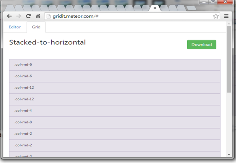
The best part is, after all you can download the html file of the layout by clicking Download button.
Note: Please change the **bootstrap.css* file path defined in downloaded layout.html to match with the relative file path of bootstrap.css file in your app. By default it is*
<link rel="stylesheet" type="text/css" href="bootstrap.css">
Dig In
The ultimate goal of the drag n drop editor is to provide the layout as a json array of divs once click on Grid-It button. A div element contains following properties.
- xIndex (column)
- yIndex (row)
- width
- height

For example the json array for above layout is
[{"xIndex":0,"yIndex":0,"width":6,"height":1},{"xIndex":6,"yIndex":0,"width":6,"height":1},{"xIndex":0,"yIndex":1,"width":8,"height":1},{"xIndex":8,"yIndex":1,"width":4,"height":1},{"xIndex":0,"yIndex":2,"width":4,"height":2},{"xIndex":4,"yIndex":2,"width":8,"height":1},{"xIndex":4,"yIndex":3,"width":8,"height":1}]
This array is used to generate actual bootstrap layout.
Improvements
As I experienced drag n drop code generating editors rarely completely solve an addressed problem. This is applicable to the gridit as well. Currently the tool only allows generating layouts for medium devices (col-md). For now, this tool is helpful to the ui designers at least to some extent as I believe.
I am not a ui designer and I mostly consider about the functionality and accuracy of drag n drop editor. I am planning to support adding nesting columns as described in bootstrap site in near future.
Contribution
Grid-It is an open source project under Apache license. Source code in available in https://github.com/prasadKodeInCloud/gridit
The github project consists of a branch called gridster-bootstrap which supports gridster-bootstrap library integration.
Please report bugs and suggest features in github project. You are welcome to improve the tool as well providing better algorithm to generate layout.
Thanks !!!
I am a software engineer interested in javascript , game development and tool making
